When How and Why approached us about their new project, we were delighted. I had read some of their articles and was blown away by the talent they have at making complicated topics totally understandable for the layperson.
At that point I hadn't realised that they were also quite artistic. I'm not just talking about the drawings and images that they produce; I'm talking about the way they approached the project. The colours and feel of the site was quite clear in their heads.
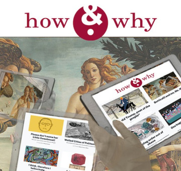
How and Why had a clear vision of what they were trying to achieve and had done significant research into what their audience would be looking for and how they could bring something new to the arena.
I started to understand why they had not chosen to go with a CMS that tied them into a theme. They didn't want to use a theme, they wanted to create a totally new experience for their readers.
They needed to be able to insert images exactly as needed, they wanted to be able to use drop caps when they felt it was appropriate, they wanted to emphasise text with block quotes or pull quotes. They wanted the whole site to effervesce with their own brand of witty science.
We created a web design to match their requirements and we advised them on how to work most efficiently. We developed the site so that they could have bite sized content that could be re-used on key parts of the site. We advised them on how to promote features and how to entice visitors to share their content on social media platforms.
It's a beautiful site full of rich information in images and text.
We are proud to be part of the project.